Justin Hall
14 March 1995
Statistics 2
Gudmund Iversen
Surfin' Statistics
As the Internet moves to the forefront of the information and entertainment media sphere of influence, people are struggling to get an overview of the intangible virtual world.
folks want to know...
who's online, how they got there, what they would pay for, and who's next
or
who's publishing what online where.
While the net makes data collection easier than ever, the sprawl of it all makes it impossible to ascertain veracity.internet statistics:
Folks turn to statistics to yeild demographic portraits of the net, but unfortunately, Internet users tend to be elusive beasts. Often, while trying to grasp hold of the oft told explosive growth of the Internet, user counts, and user statistics are hurled about with astonishing disregard. People intent on proving their point toss out figures without traces of substantiation.
controversy!In fact, controversy has arisen over this issue. Disagreement over Internet user counts was catapuled to center stage after cyberclastic journalist Peter Lewis's front page article in the New York Times on August 10, 1994 "Doubts are Raised on Actual Number of Internet's Users." Lewis saught to dispel casual reference to tens of millions by quoting an expert who said "Suppose there were really only two million or three million."
It is hard to say how many different computers there are on the Internet, and it is impossible to know how many users there are on those computers. Estimates generally range from two to thirty million.
People intimate with the net are oft heard quoting in the tens of millions range -
"how many people are there on the Internet?"But definitions of what it means to "be on the internet" differ. Most people consider an e-mail account proof of internet membership, but does that mean that folks at America Online are part of the Internet as well? When you are doing a statistical survey of the Net, this is an important distinction to make - it means a difference in the millions.
"oh, twenty or thirty million."A system of differentiating between Internet users was set up by Matrix Information and Directory Services: New Data on the Size of the Internet and the Matrix. In terms of internet statistics, their definitions are critical to discussion of the size of the net.
They set up three ranked variables distinguished by level of Internet participation (these are direct quotes):
With these, they set up useful Internet user count differentiation. The attached numbers are of course still gross estimations, but they are more convincing broken down into this form.
- For the Core Internet, we estimate 7.8 million users (people) of 2.5 million computers that can *provide* interactive services such as TELNET (remote login), FTP (file transfer) or WWW (hypertext), as of October 1994.
- For the Consumer Internet, we estimate 13.5 million users of 3.5 million computers that can *use* the interactive services supplied by the core Internet, for example people who can use Mosaic or Lynx to browse the World Wide Web, as of October 1994.
- For the Matrix, we estimate 27.5 million users who can exchange electronic mail with other users in the Matrix, as of October 1994.
small potatoes
a commercial entity trys its hand at surveying the sprawl
Much of the difficulty of compiling statistics of Internet use is due to the very nature of the net itself. While it is possible to log computer usage, it is currently impossible to tell who is on the keyboard. Since people choose what they want to read, no one is obliged to answer anything. Take, for example, this user profile survey by Mike Rissa & Co. The results are culled from a low 554 responses. This is not so bothersome since this is a demographic survey more than a total Internet population census. Still, that is a miniscule sampling of the conjectured online masses.Once you get past the sampling problems, the data are presented in two different forms that overall, convey the information well. Presentation is aided by the fact that the computer can utilize colour, which bypasses the obscure black and white patterns newspapers often use to differentiate variables. There are twelve illustrations here, alternating between histogram and pie graph. Most of them are clear, but many of them are problematic.
- What type of computer user are you?
- The distinction between the categories of users is impossible to make out from this chart. What makes a "power user"? This is a failing of context - if the graph was included with the data, this might be clearer.
- What is your gender?
- A great failing of the net is here revealed. While the sampling is low, my experience gives me no reason to doubt the veracity of the finding. The pie chart is demonstrative, especially as it shows the majority almost engulfing the minority.
- How old are you?
- What kind of organisation do you mainly work for?
- The data stacking here is hard to follow. It would be more instructive if it were listed by rank as opposed to loose order by professional.
- How many hours per week do you spend with a computer?
- Are you willing to pay for information published in WWW servers?
- This data would have been better presented as a unimodal histogram
- How long have you been using WWW servers?
- What kind of WWW information would you be interested in?
- This graph is hard to read, because of the vertical text. There is good information here, perhaps a smaller, horizontal font would better convey it. The formatting is poor overall, the third bar has a floating "s" - cut off of the end of research publications. That is unseemly.
- What OS are you running in your primary workstation?\
- The percentage of OS/2 users is lost because the graph is too dense and the pie segments aren't isolated. This could be alleviated if the data was replicated elsewhere, or the number was moved.
- What kind of primary Internet connecivity do you have?
- Are you behind a firewall or a proxy gateway?
- How fast is your primary Internet connection?
larger potatoes
a web-endorsed university gives web demographics a second survey
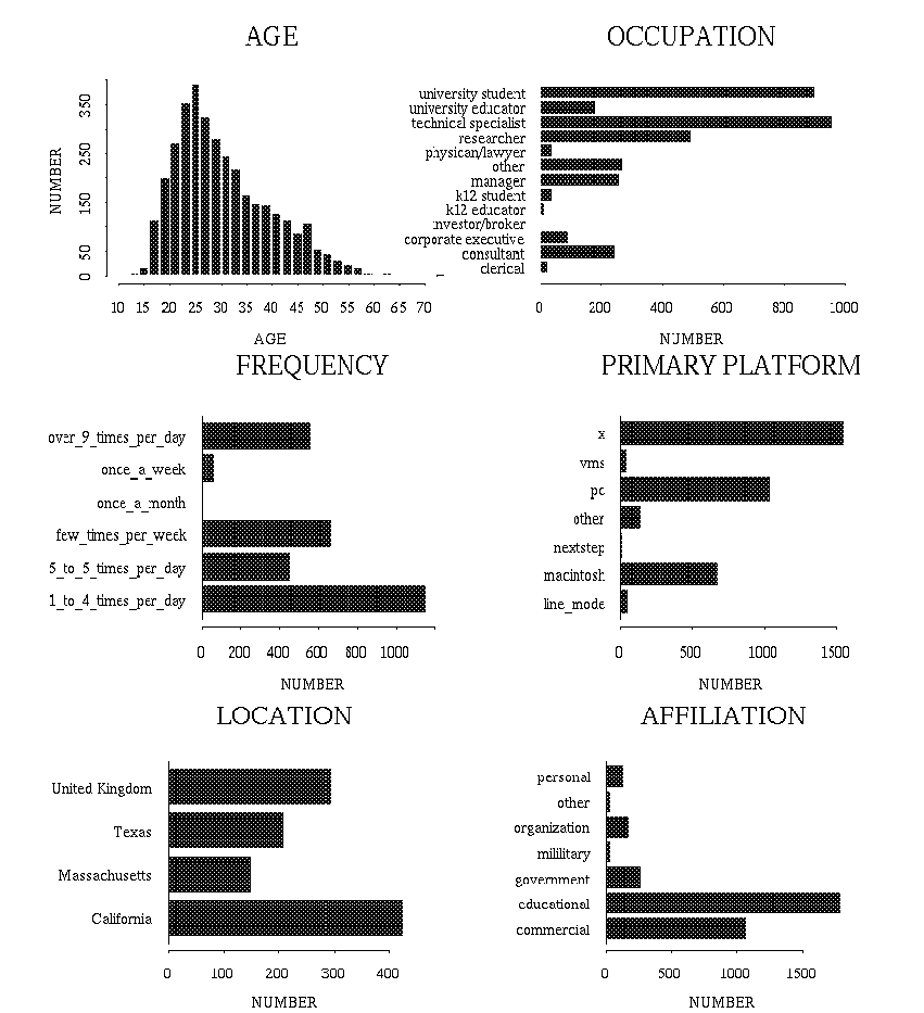
October 10 through November 16, 1994, the Graphics, Visualization & Usability (GVU) Center out of Georgia Tech, ran a 2nd WWW User Survey. They asked a broad spectrum of questions, and generated a wealth of graphs and tables, 45 in all, for all questionares provided. Their response rate far exceed that above, in one month, they gathered responses from over 4000 users.The treatise Using the Web as a Survey Tool, by James E. Pitkow and Margaret M. Recker, shows they applied a great deal of thought to collecting Internet statistics. Being that this was their second attempt, they fixed up the collection mechanism, and added adaptive questioning. In addition, they debate the relative merits of various forms of user data collection online, explaining how they arrived at forms-based world wide web collection as the best choice. Whilst comparing it to e-mail, we can see how the web provides an optimal means of statistic collection:
Use of Web technologies helps to minimize the above costs by: 1) enabling point-and-click responses, 2) providing structured responses, 3) using an electronic medium for data transfer and collation, 4) presenting the questions visually for re-inspection and review, 5) imposing very loose time constraints and finally, 6) utilizing adaptive questions to reduce the number and complexity of questions presented to users.In fact, use of the web technology allowed them to detect duplicates 3.8%. As the surveyors note, "As demonstrated by the high number of survey respondents, the Web provides an easy-to-use, reliable, and low overhead survey medium." A survey of the web, on the web, found little to surprise: "[the statistics] suggest that the typical user is a 30-year old educated male from North America who works with computers". That this was arrived at from surveying 4000 respondents implies a low standard error. Combined with the fact that this corroborates results elsewhere, gives this survey an air of plausibility.There are eight overview graphs of the basic demographic survey results.
- Age
- Using a histogram and a data table, this page provides a stronger survey of the age of online folk. The data is presented in a clear, readable form, though the table's columnar colour scheme is a bit misleading. They do provide the maximum, minimum, mean and median age, however, which is a big plus.
- Education
- This graph is demonstrative of the education level of the Internet. Since decimals have been dropped, there are two non-categories, with zero percentage. Also, professional is mispelled (that's when you are glad that you are dealing with a non permanent medium).
- Gender
- This chart bears the same 90/10 % conclusion that the 544 response survey found above. This portrayal is better, if only because 3D graphs look cooler, and there is also a histogram provided. (Note: I make no claims that 3D graphs aren't rife with chart junk - cooler is completely subjective. Though, in the case of web data, there is no question of wasted ink, only screen size and attention span).
- Media Types
- This question is only for the folks that find themselves answering yes to web publishing questions. It covers the various forms of media that these folk publish online, as part of their web pages. This graph and table leave something to be desired. There is no rank order applied to the data on the table, nor to the graph. It would have been easier to follow had the data types listed in the graph legend been listed in rank order.
- Use Web Browser to Access Newsgroups
- By the time I reach this, the 40 some odd table, the question and data presented have become less obvious. The numerical scale, while explained, is a bit unilluminating. This is the weakest graph of the bunch. Of course, the information is still adequately conveyed - a testament to the strength of the statistics department at Georgia Tech!
- Summary of Usage
- My above complaint is resolved by this histogram, which places the Newsgroup data in a larger context.
Demonstrating the information retrieval prowess of the Internet, the entire demographics file for this study is available online, at over 500k.
counting web pages
The recent explosive growth on the Internet has taken place primarily on the World Wide Web. Since people began tooting the web horn (say mid-1994), there have been attempts made to count web pages. Since they already numbered in the hundreds, and are now in the hundreds of thousands, if not millions, computerized search mechanisms were devised to tackle the task.This leads to confusion since each search tool has different programming and parameters, so the results can vary widely. The regularity to hope for is relative - that is, growth related to a previous estimate from the same source. Fortunately, Matthew Gray has been charting the Growth of the World Wide Web since May of 1993.
While he could say with a good degree of certainty that he was covering the spread of the web when there were hundreds of servers, now nothing more than gross approximation can be assumed. He claims that all numbers represented for total number of servers are meant to be indicators of a minimum number of acutal servers. Since a similar data collection mechanism has been employed throughout, his data provides a study of growth, as opposed to an absolute server count.
He provides the data in graphical form a line graph, showing the curve of WWW site growth from June 1993 to January 1995. It does an adequate job conveying the rapid upswing in web publishing. The actual numbers are available at the site, but they are so gross, as obviated below:
Web growth has been so pheonomenonally large, the focus of his page is largely the growth itself, as opposed to methodology or accuracy of his study.June, 1993 130 sites
December, 1993 623 sites
June, 1994 1265 sites
December, 1994 11576 sites
conclusion
Comparitive growth data, relative to earlier surveys with similar setups, is the most compelling data that has been gathered. Otherwise, the Internet is simply too sprawling, and open to users, to allow for a more accurate count and comparison between different studies. Overall guestimations of the totals must be assumed to be part of propoganda efforts, unless they are couched in unreality.
the elusive internet userThe Internet provides perhaps the most seamless means of data collection to date. No paper must be wasted, nobody has to leave their desk, data is automatically available for manipulation and publication, and surveys developed can be reused with the click of a mouse.
Easing the difficulties of data collection will free future statisticians to consider issues of representation and accuracy. The population and sample pools are so much larger, there is a good bit of experimentation to be done to bring us closer to statistical enlightenment.
bibliography
- Much of the data I used for this paper I found at the Yahoo List collection of Internet Statistics and Demographics pages
- At their Global Network Navigator site, O'Reilly and Associates has compiled a Measuring the Net page with new and historical considerations of Internet size.
- Another treatment of this issue is available Wanted: Net Census, by Donna L. Hoffman and Thomas P. Novak, from Wired 2.11, November 1994, pp 93-94. Also from their How Big is the Internet?
- Point of interest: famous American pollsters the Gallup organization now have their own web site. Take a survey, read some results.
Justin Hall / Swarthmore College / justin@cyborgasmic.com