
High Fiver: David Siegel
I wish I could find it. I remember recieving an e-note from David Siegel that the arbiter of decent web design had finally arrived.See a new side of Pathfinder. They get better every day. I hope you'll visit their new travel section, put up by contributors, including yours truly.Unrepentantly, he posted his own "Casbah" as the first winner of his High Five Award for web design.
The site wasn't bad, a few momorable aspects - coffee stain on the desktop, cool Frank Lloyd Wright fonts.I guess the High Five award was intended as more than simply a device for the promotion of David, since other people won. And yet, one week we find him Praising Pathfinder design, and suggesting,On the other hand, it demanded a lot. You didn't get to the information, view it your way, you had to use his multiple page fantasy tunnels, and tailor your browser to fit David Siegel.
That would have been less of a problem if the content was particularly compelling - as it was, largely promotional, I wondered why he was making me strain to look at his portfolio.
From reading that, you'd gather the High Five is selected by the obviously impartial David Siegel. And yet, we find this gem to lead off the column,Here at the High Five, we only give our award to sites that earn it. We work with the chosen site designers to make them as good as they can be. If we wanted the back-traffic, we would have given Pathfinder the award months ago. This week Pathfinder gets the High Five, because they've really earned it.Earned it, because Pathfinder has finally posted something by David Siegel? Because they're now a client?Balls, like announcing himself as the first winner, like wearing an ascot takes balls of a certain size, or perhaps a peticular shape, check out this photo:
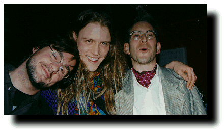
January 9, 1996, Wired third anniversary party.
Thank the lord for Zane Vella (on my right)
David's sites are pretty nice looking, provided you surf them with a 20 inch monitor. He's an unabashed visual elitist:
   Dear Lynx User,

   Thank you for coming to my site. Perhaps you've heard good things
   about it. I hope so. I occasionally get mail from Lynx users who say
   my site isn't very "Lynx-friendly." That's because my world is visual.
   I don't have much here for you, really, since all my tips and
   techniques have to do with using images to get what I want. You can
   get the most out of my site with a visual browser. If you choose to
   come here with Lynx, I can only hope you'll visit a few of my
   less-visual sections.

   Please visit my diet section to learn about vegetarianism, or you may
   want to read my new essay, The Balkanization of the Web. That's about
   all there is for you here, really. Please don't send me mail about
   this page. If you want to see the rest of my site, come back to this
   URL with a visual browser. Good luck!
Sure the backgrounds are funky - he's got this speckled blue strip running down the left side of high five and the text laid out suck style along the right - unfortunately it doesn't line up right on Macintosh NetScape 1.12, I can't read it. I tried his suggestion for ergonomic type sizing my browser, which reduced the strain on my eyes, but I still couldn't read his High Five.Strewn throughout, he's got these fortunately fast loading two colour graphic billboards in his wonderful fonts, but one third of them hangs outside my browser window - even in the non-Netscape version of the page.
I guess I shouldn't let my browser
stand in the way of good design.
stand in the way of good design.
garrett county journalSorta reminds me of what Bill Machrone said about HotWired - "people are tired of their too sexy for my browser attitude." I'm supposed to rearrange my shit for him, I find that tiresome.
Kind of like going to a web site and finding nine tiled pictures of Marilyn Monroe on the front page. Andy Worhol killed her, let's move on.
In light of his pretty, not soul shaking pages, what I find more interesting, and design boundary pushing, is designing within a tighter framework:
these are the remedy to Siegelesque pages - they don't impress you by making you wish you had their computer.When I met him at a Wired party, he kept asking me what I was working on. When I asked him, he said grandly - "Big stuff. Big companies."Big monitors.
You can learn so much about him from his Dine with Dave entries, and of course his journal.
justin's links by justin hall: contact